
 Reply With Quote
Yes, but fonts are still very ugly (have you tried Microsoft Arial font?)
I'm customizing Knoppix on my PC and would like to improve the way fonts look. Any hints?


I submitted this howto over at the linuxtag site perhaps some in this forum will benifit from it as well. I've had a lot of trouble with fonts and linux in the past but getting nice true type fonts is no problem in Knoppix thanks to the KDE font installer. Here's what you do:
Open the KDE Control Center
Go to "System"
Go to "Font Installer"
On the "Install From" side of the screen locate the directory which contains the fonts you want to install and select said fonts.
Click "Install"
Click "Yes" to the popup which asks if you want to copy fonts to X11 fonts folder (/home/knoppix/.kde/share/fonts)
Click "Apply" on the "Install To" side of the window.
Click "Yes" to the "Apply system changes now?" popup.
You're done.
For some reason the Control Center locks up on my system after this so you might want to use xkill to get rid of it.
If you save your changes to a floppy (taskbar /KNOPPIX/Configure/Save KNOPPIX configuration), you will have access to these fonts when you reboot as long as you type "knoppix floppyconfig" at bootup.
I've done this proceedure both from the cdrom and from a hd install and it works great. If you want to do this this on a version of Knoppix on your HD and make the fonts availavle system wide just run the Control Center (kcontrol) as root and do the same thing.
Yes, but fonts are still very ugly (have you tried Microsoft Arial font?)
I'm customizing Knoppix on my PC and would like to improve the way fonts look. Any hints?
Although I'm a native English speaker, I needed to install some Greek and Hebrew fonts. They actually appeard to be nicely anti-aliased using the method above. I haven't tried this with any other fonts yet (i.e. Arial).Originally Posted by vedran
One thing to note: if you use the method outlined above, KDE is going to install the fonts for the local user (knoppix) at /home/knoppix/.kde/share/fonts. This works well if you want to boot from the Knoppix CD. If you save your changes to a floppy (see floppy customization above), then you won't have to go through the whole process again when you reboot from the CD. You may want to try installing Arial using this method. Since it installs locally, it should override the way Arial is otherwise rendered and so you may get nicer anti-aliasing.
If you have Knoppix installed on your hard drive, just run kcontrol as root or use and you should be able to try this out on a system wide basis. You might want to try uninstalling and reinstalling the fonts this way to see what sort of anti-aliasing you can get. The fonts I've installed so far look terriffic in KDE and in some WINE applications I'm running.
Rember to enable anti-aliasing in the KDE control center under Look & Feel/Fonts. Before you install the fonts with the Font Installer, you may also want to click on the anti-aliasing tab at the top and enable sub-pixel hinting.
I'm tied up this weekend so probably won't have a chance to mess with this untill later, but post your success/failures and wheter or not anti-aliasing is working for you.
Ok, I run Knoppix from CD. I've installed Arial using the procedure you described, from my Win98SE partition. Here is a screenshot from KWord comparing the built-in font Helvetica and Arial, no anti-aliasing:
http://members.smartnet.ba/vedran/snapshot1.png
Here is the same file, with anti-aliasing:
http://members.smartnet.ba/vedran/snapshot2.png
This is a shot of this same file opened with my Red Hat 7.3, no anti-aliasing:
http://members.smartnet.ba/vedran/snimak1.png
For some unknown reason, I can't get aa to work in RH 7.3. Now, as you can see, in RH Arial is actually much prettier than Helvetica, which is good since Helvetica is a bitmap font and it's not available in some sizes (10, 13, etc.) While in Knoppix it's the other way. AA helps a bit, but it makes everything fuzzy and blurred and gives me a headache. Also it doesn't really solve some key issues, such as: in size 9 r is about as tall as the horizontal line in A, while with size 11 it's much taller; size 11 appears to be taller than size 12; there's a small pit on top of O and Q; size 11 A appears to be bold; etc. etc.
This is rather surprising, since people claim that font rendering has improved in RH 8.0?
Some people say that this is the trick:
http://www.cs.mcgill.ca/~dchest/xfthack/
Maybe someone should add this to Knoppix?
To me, Arial in the seconc pic certainly is improved in terms of anti-ailising. I can't speak to the fuzziness/headache factor. Regarding the XFT hack, it would be nice if it was included in Knoppix. To me it looks like this makes a dramatic improvement in the appearance of the fonts.
- edited -
see my post in this Topic
 Posting Permissions


Dell Poweredge R640 Server | 2x Silver 4114 20 Cores | 96GB | 8x 1.8TB Dell SAS
$2749.99

Dell PowerEdge R630 8SFF 2.6Ghz 20-Core 128GB Mem 2x10G+2x1G NIC 2x750W PSU
$399.04

Dell Poweredge R640 Server | 2x Xeon Gold 6132 | 128GB | H730P | 8x HDD Trays
$1849.00

Dell PowerEdge R740XD Server | 2x Gold 6140 | 128GB | H730P | 8x 3.5" HDD Tray
$2589.00

Intel Xeon Gold 6140 SR3AX 2.3GHz 18-Core Processor CPU
$44.99

Intel Xeon E5-2697 v2 2.7GHz 30M 12-Core LGA2011 CPU Processor SR19H
$27.99
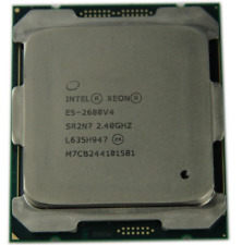
Intel Xeon E5-2680 v4 2.4GHz 35MB 14-Core 120W LGA2011-3 SR2N7
$17.99

Intel Xeon E5-2697 V4 2.30 GHz 18C 2011-3 2400MHz 45MB 145W SR2JV CPU Processor
$49.99

Dell Precision T5600/t5610 Xeon E5-2670 2.6Ghz 16GB DDR3 RAM NO HDD Nvidia
$85.50

Lenovo ThinkStation P920 1.5TB SSD OS Intel Xeon Silver, 2.40 GHz 16GB Desktop
$630.00