

... or rather, I suggest to remove something that is an unnecessary difficulty:
This nice background of Knoppix 4.02 has a "tag" that says
KNOPPERNET
Dipl.-Ing. Klaus Knopper
in light-grey and white, at the left side of the screen, a bit below the middle. Pitifully, you might have enough devices so that the text description of one of them lies on top of this "tag" - and now both are hard to deciver, until you move the device away.
My suggestion for the next time:
- Move the tag to the right side of the screen, or
- Make it bigger, with darker text and a bit blurred so that it does not interfere with the device description anymore.
Have fun
Dirk
 Posting Permissions

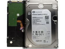
Seagate ST8000NM0055 8TB 7200RPM 256MB SATA 6.0 Gb/s 3.5" Enterprise Hard Drive
$41.37
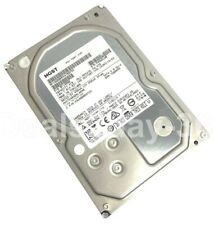
HITACHI HUS724040ALA640 4TB 7200RPM 64MB SATA 6.0Gb/s 3.5" HARD DRIVE ZERO HOURS
$52.00
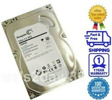
Seagate ST1000VM002 1TB 64MB SATA6Gb/s 3.5" (Low Power) Hard Drive -PC, CCTV DVR
$24.99
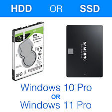
1TB HDD/SSD 2.5" SATA Hard Drive for Laptop with Win 10/Win 11 Pro Pre-installed
$44.55
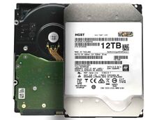
HGST Ultrastar DC HC520 12TB SATA 6Gb 256MB 3.5" Enterprise HDD- HUH721212ALE601
$89.99

HGST Ultrastar HE10 10TB SATA 6.0Gb/s 7200 3.5" Datacenter HDD - HUH721010ALE601
$69.99
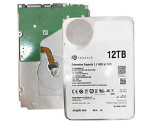
Seagate ST12000NM0127 12TB 256MB 7200RPM 3.5" SATA 6.0Gb/s Enterprise Hard Drive
$87.99
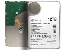
Seagate ST12000NM0127 12TB SATA 6Gb/s 256MB 7200RPM 3.5" Enterprise Hard Drive
$99.99
5 PACK Hard Drive, SATA ,2.5" in , 500GB HDD, Slim Form 7mm Seagate/WD/Toshiba
$29.00
Western Digital 4TB Internal 7.2KRPM 3.5" (WD4000FYYZ) SATA Hard Drive ZERO HOUR
$69.99

 Reply With Quote