-

Originally Posted by
cintra
Hei
The change is fine.. only thing I have always thought tho' is that the text appears greyish, more difficult to see than other sites..
That could well be partly my eyes, but might also be due to the general lightness of the background, compared with other sites...
mvh
Update: The date text under 'Last post' column is a slightly darker blue which is much easier to read.. 
Have since fixed the default colour in Firefox and all is well...
regards
EDIT I've just been over to the Suse forum at http://forums.suselinuxsupport.de/ and notice how, altho the overall effect is light, its easy to read and navigate the site, and it gives a general good feeling. Something the current web-designer ought to have a look at perhaps?
Btw, the Knoppix site seems to have become more difficult to navigate with mouse gestures...
Similar Threads
-
Replies: 4
Last Post: 04-11-2005, 05:27 PM
-
By dragonx in forum The Lounge
Replies: 0
Last Post: 02-07-2004, 11:43 PM
-
By Franko in forum General Support
Replies: 4
Last Post: 11-18-2003, 12:55 PM
-
By bongski55 in forum Customising & Remastering
Replies: 0
Last Post: 06-04-2003, 11:26 AM
 Posting Permissions
- You may not post new threads
- You may not post replies
- You may not post attachments
- You may not edit your posts
-
Forum Rules

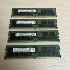
128GB (4x32GB) SK hynix DDR4 PC4-2666V RDIMM ECC Server Ram HMA84GR7CJR4N-VK
$799.00
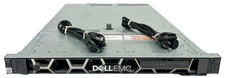
Dell EMC PowerEdge R440 Xeon silver 4215 2.5GHz 16 GB ram 2x 550W PSU No HDD
$275.00
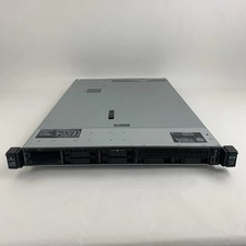
867959-B21 HPE ProLiant DL360 G10 CTO Server W/ 2x 865414-B21 1x 840140-001
$245.00
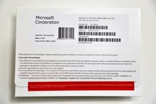
Microsoft Windows Server 2022 Standard 64Bit 16 Core-50 CALs DVD With Key&
$69.90
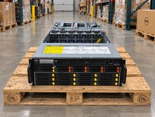
Gigabyte 4U AI Server 10x Nvidia GPU 2x Xeon Gold 6150 36 Core 2.7GHz DDR4 RAM
$1499.00

Dell PowerEdge C4130 1U AI GPU Server | 2x E5-2680 v3 | 32gb Ram | 2x 1600W
$409.99
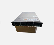
Dell Poweredge R730xd 12LFF 2*2660v4 4*1Gbe h730 2x 750W Server CTO
$308.00
Dell PowerEdge C4130 1U AI GPU Server | 2x E5-2690 v3 | 64gb Ram | 2x 1600W
$524.99
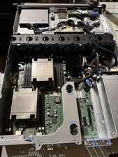
Dell PowerEdge R530 2x E5-2630v4 H330 iDRAC8 Port Card Riser No PSU/RAM/HDD
$99.99
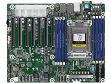
Asrock Rack ROMED8-2T Server Motherboard AMD EPYC 7003 (with AMD 3D V-Cache Tech
$747.99



 Reply With Quote