
For people who are visually impaired it would help if the default colors were high contrast. Two places in particular I've noticed that are problematic include the 3.8 startup boot prompt (pink on black) and vi in xterm (dark purple on black).


For people who are visually impaired it would help if the default colors were high contrast. Two places in particular I've noticed that are problematic include the 3.8 startup boot prompt (pink on black) and vi in xterm (dark purple on black).
 Posting Permissions

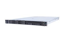
HP ProLiant DL360 Gen 11 - Xeon Gold 5th Gen - 192 GB DDR5 ECC - 2x 240 GB SSD
$17000.00
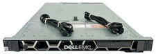
Dell EMC PowerEdge R440 Xeon silver 4215 2.5GHz 16 GB ram 2x 550W PSU No HDD
$275.00
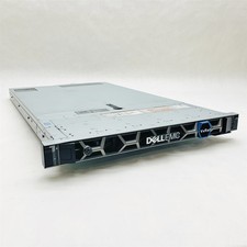
Dell EMC VxRail E560F 10-SFF 2*Gold 6230R 2.1GHz No RAM HBA330 iDrac Ent Server
$349.99
Windows Server 2025 Standard✔ 24-CORE✔ 10 CALs✔ 50 RDS✔ Remote Desktop EP2-25205
$317.56
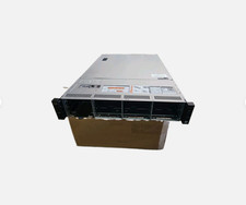
Dell Poweredge R730xd 12LFF 2*2660v4 4*1Gbe h730 2x 750W Server CTO
$308.00

Dell PowerEdge C4130 1U AI GPU Server | 2x E5-2680 v3 | 32gb Ram | 2x 1600W
$409.99
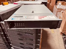
Dell EMC PowerEdge R740 8 Bay Server w/ 32GB RAM 2x GOLD 6132 2x 1600W PSU H730p
$499.88
Dell Poweredge R630 2x Xeon E5-2680 v3 2.5ghz 24-Cores / 64gb / Raid / 2x 1Tb
$374.99
RDS CAL - Remote Desktop Services Windows Server 2022 50 User/Device Connections
$68.00
Microsoft Windows Server 2025 Standard 64Bit 16 Core-50 CALs DVD With Key Sealed
$41.19

 Reply With Quote