-
decent cursor
This is just a cursor but I sometimes use the mouse, and I know you do too: this default 3D alpha-blended clumsily shadowed cursor is just uncomfortable.
I think the default cursor should be simple and _viewable_ on any display: this include being well contrasted and big enough. If the shadow should become an absolute necessity, then it would better not be so far away from the cursor.
First time users and newbies could be disappointed, if not upset: the cursor is the first thing they'll use. But, of course, they want to customize. Well, that's another problem!
Similar Threads
-
By kkiedrowski in forum Hardware & Booting
Replies: 2
Last Post: 06-03-2005, 11:25 PM
-
By CrashedAgain in forum General Support
Replies: 3
Last Post: 10-14-2003, 05:26 AM
-
By CrashedAgain in forum General Support
Replies: 2
Last Post: 10-06-2003, 04:02 AM
-
By donkthemagicllama in forum Hardware & Booting
Replies: 8
Last Post: 04-08-2003, 10:57 PM
-
By silicosick in forum General Support
Replies: 3
Last Post: 04-06-2003, 06:14 PM
 Posting Permissions
- You may not post new threads
- You may not post replies
- You may not post attachments
- You may not edit your posts
-
Forum Rules

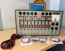
Refurbished Working 1960's Heathkit EC-1 Educational Electronic Analog Computer
$2999.99
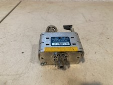
Vintage George A Philbrick Researches Tube Analog Computer Module Serial 005503
$109.99
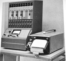
1969 EAI TR-20 Analog Computer Programming PACE Philbrick Electronic Associates
$36.00
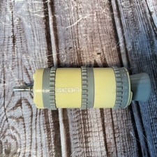
Vintage Goodyear Electronic GEDA Analog Computer Plug -- Extremely Rare
$179.00
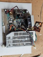
Retro Working Macintosh SE SE30 Analog Board 820-0206-B 630-0147 w/Power Supply
$107.95
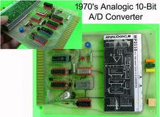
Vintage 1970’s Analogic MP2110 10-Bit A/D Converter Computer Circuit Board
$24.99
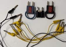
Vintage Donner Scientific Analog Computer Patch Cords Banana Plugs & Resistor
$100.00
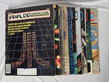
Vintage Analog Computing Magazines For Atari Computer Owners No 11-20 Acceptable
$75.00
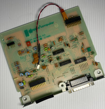
VINTAGE Apple Unidisk Analog Card - Circa 1986 | P/N 820-0190-A
$22.67
Vintage HP 82166A HP-IL Converter Custom “The BOX” TTL/DAC Interface Controller
$499.99



 Reply With Quote